Full Colour Palette
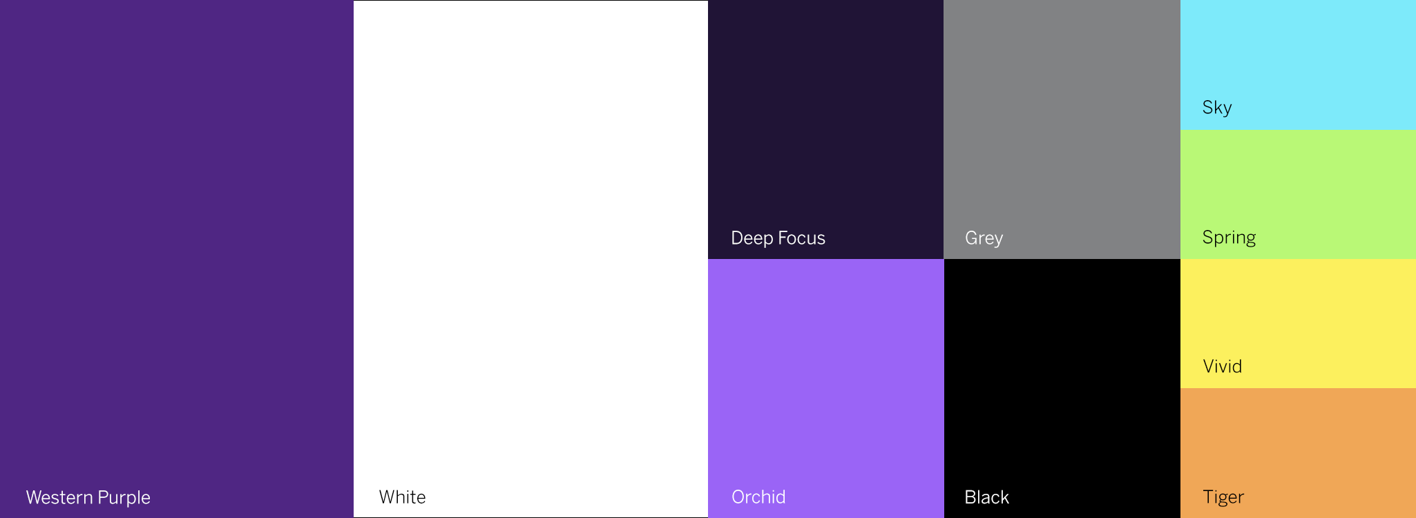
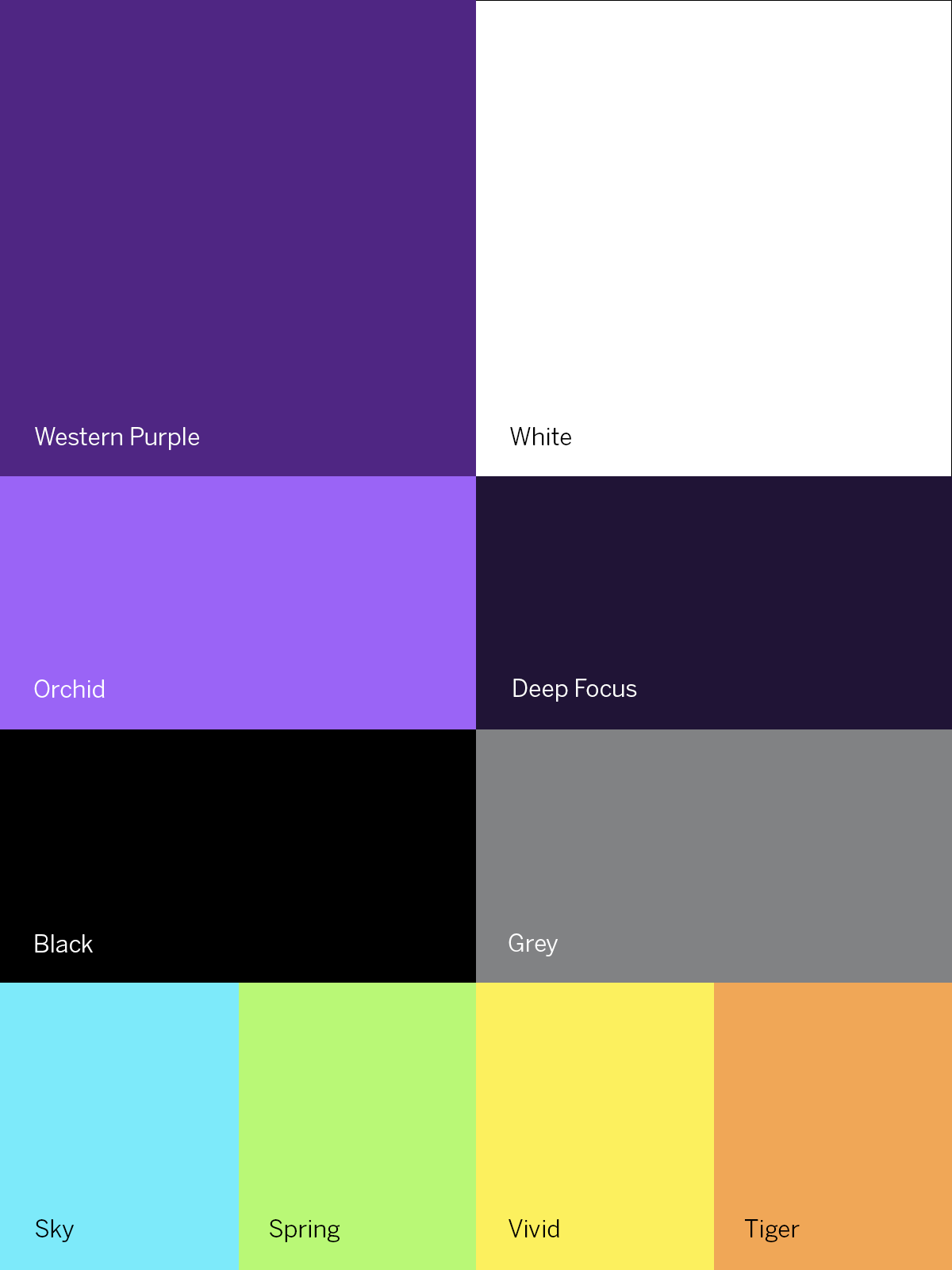
The full colour palette is designed to reflect and honour the purple and proud history of Western, while allowing flexibility to convey a mood based on intended audience and context.


Primary Colours
The colours purple and white are integral to Western as an educational institution and community. Purple is a part of Western's history and identity. Purple and white are to be used liberally across creative in backgrounds, headlines, illustrative elements, text containers and more.
Note: Western Purple is ideally printed as a Pantone ® Matching System (PMS) spot colour, however, CMYK process may be used where spot is not available.

Western Purple
Print PMS: 268 C
Print CMYK: 82, 100, 0, 12
Digital RGB: 79, 38, 131
Web Hex: #4F2683

White
Print PMS: N/A
Print CMYK: 0, 0, 0, 0
Digital RGB: 255, 255, 255
Web Hex: #FFFFFF
Secondary Colours
Two new purple colours, Orchid and Deep Focus, can be used in conjunction with Western Purple to add depth, dimension and variety to creative. These shouldn’t be the sole purple shades used. They can add visual interest to creative via headers, text containers and a filter overlaying photos.
Grey may be used for backgrounds to provide visual interest (a transparency may be used to achieve a lighter tone of grey). Black is reserved for copy and should not be used as a background colour.
Note: Orchid must be printed as a Pantone ® Matching System (PMS) spot colour and not CMYK process.

Orchid
Print PMS: 265 C
Print CMYK: N/A
Digital RGB: 154, 100, 246
Web Hex: #8F55E0

Deep Focus
Print PMS: 275 C
Print CMYK: 85, 90, 45, 60
Digital RGB: 32, 20, 54
Web Hex: #201436

Black
Print PMS: BLACK 6C
Print CMYK: 0, 0, 0, 100
Digital RGB: 0, 0, 0
Web Hex: #000000

Grey
Print PMS: COOL GRAY 6C
Print CMYK: 0, 0, 0, 60
Digital RGB: 129, 130, 132
Web Hex: #818284
Accent Colours
Accent colours are just that – an accent. Purple should always be the primary colour. These colours may be used sparingly and purposefully to complement the design. Use only for small graphic elements (e.g., text underlining, arrows or other small details) that draw the eye but don't dominate the composition.

Sky
Print CMYK: 40, 0, 0, 0
Digital RGB: 125, 234, 250
Web Hex: #7DEAFB

Spring
Print CMYK: 40, 0, 80, 0
Digital RGB: 185, 248, 118
Web Hex: #B9F876

Vivid
Print CMYK: 5, 0, 75, 0
Digital RGB: 252, 240, 94
Web Hex: #FCF05E

Tiger
Print CMYK: 0, 20, 80, 0
Digital RGB: 240, 167, 87
Web Hex: #F0A757
Usage Examples


Accessible Colour Contrast
To ensure colour combinations comply with the Accessibility for Ontarians with Disabilities Act (AODA), colour arrangements are to be tested with a colour contrast checker. Contrast ratios must comply with Web Content Accessibility Guidelines (WCAG).